More Design Tips
- • How “Category Creators” Inspire and Empower Customers
- • Draw People into Your Story with the Rule of Three
- • Three Steps to Great Design
- • Overcoming Obstacles in Design
- • Try Word Lists for Advertising “Gold”
- • Building the Perfect Letterhead
- • Attract Magazine Readers with Short-Form Columns
- • Essential Dos and Don’ts for Adding Beauty to Your Page
- • Grab Them Right Out of the Gate
Room to Breathe
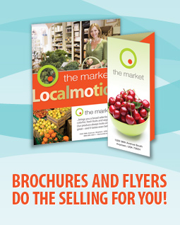
One of the most common pitfalls in design occurs when text is squeezed into borders and boxes, or wrapped too tightly around illustrations or silhouetted photographs. Next time you are faced with the challenge of creating sufficient breathing room in your designs, remember: there is beauty in simplicity. Compare the following examples of crowded vs. comfortable designs:
 |
- Increase the size of the border or box.
- Increase the size of the margins on the edges of the page.
- Add more breathing room around individual elements by increasing the white space in text wraps.
- Decrease the font size, or cut back on text when possible.


Looking Good in Print, Fifth Edition
by Roger C. Parker
This book is an excellent choice for anyone aspiring to become a successful desktop-publishing professional. In fact, it's the guide, long respected in the desktop-publishing community, and this edition has more examples of good and bad designs than ever.
The authors move from theory to hands-on projects--you apply the design concepts that they have already put forth. You learn about the appropriate design, graphic, and text elements for newsletters, ads, catalogs, and other business correspondence. Each chapter offers plenty of illustrations and ends with a checklist of reminders that you can refer to as you design.


Share this